LiveChat Rebranding

When you're about to replace your logo after showing it to millions of users for over ten years, it isn't an easy decision. But LiveChat has given me that wonderful opportunity to design it, and now it's happening - new logos for LiveChat, ChatBot, HelpDesk, and KnowledgeBase are live!

Why it was time for a change?

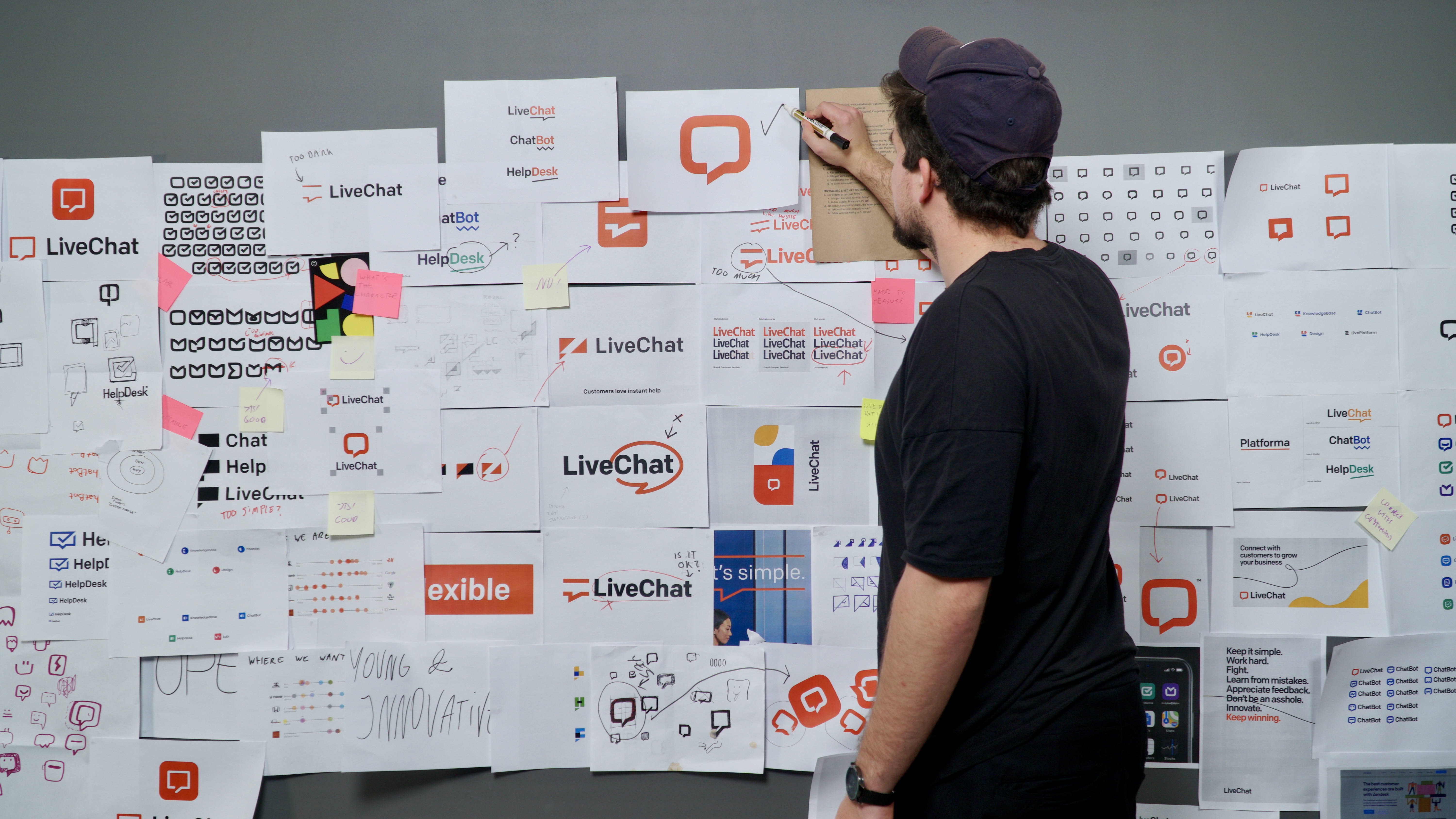
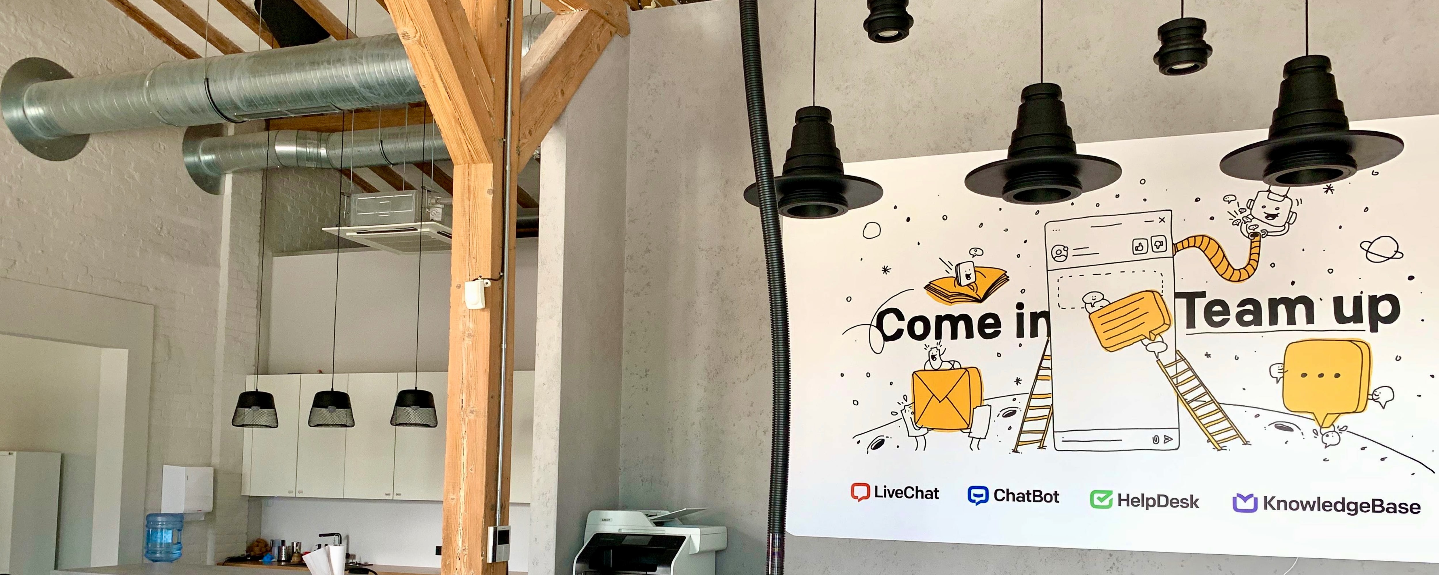
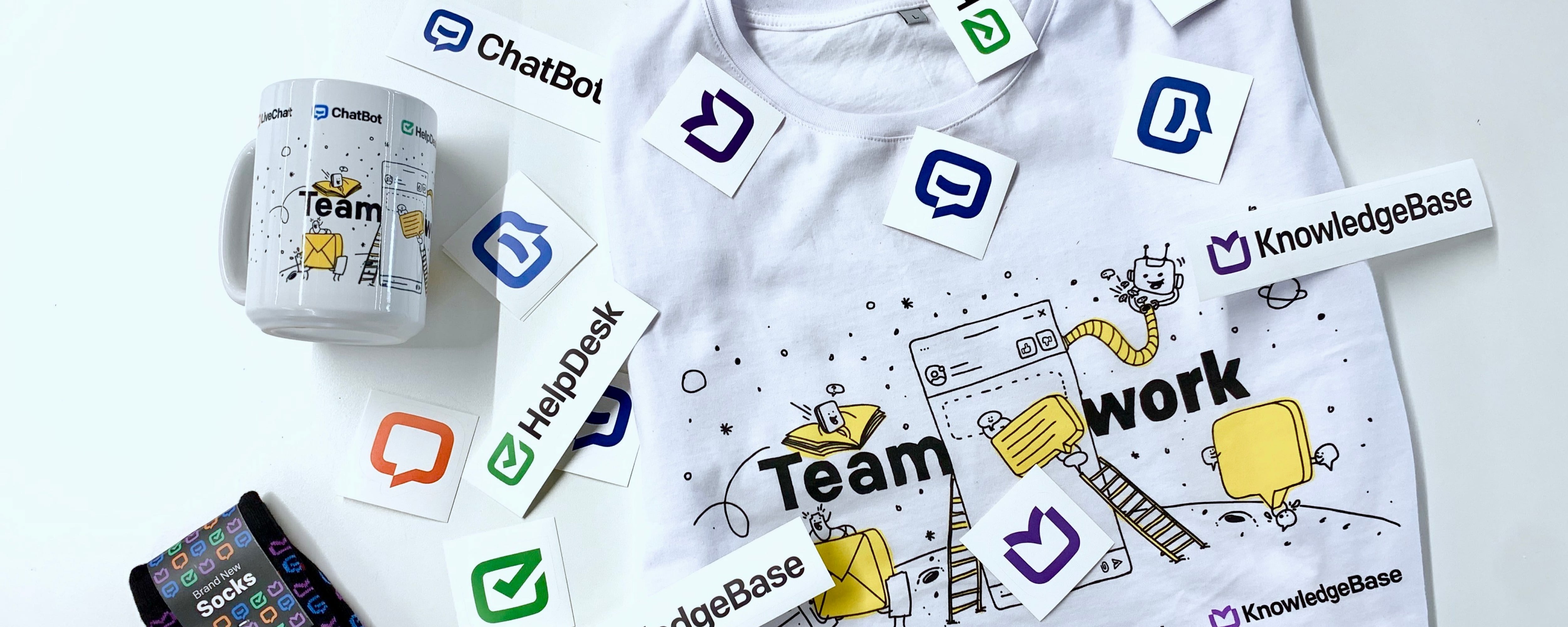
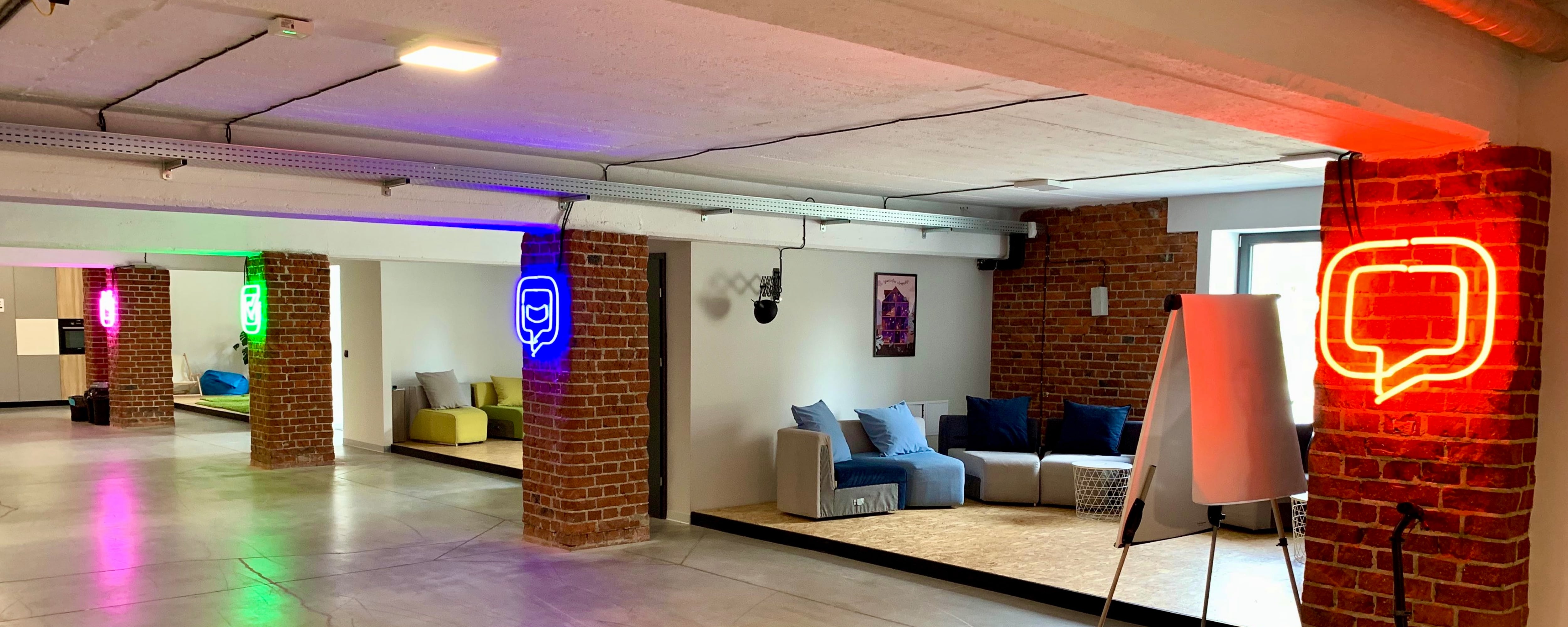
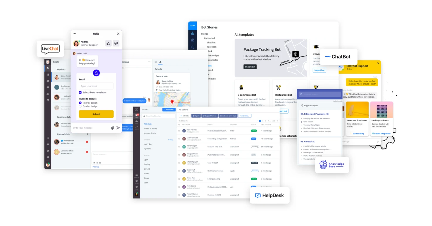
LiveChat was not a one-product company anymore. All company products had different logos but otherwise worked well together. LiveChat needed a common design language to emphasize compatibility between them and to show that they all are made by one team. Right now, the company has four products: LiveChat, ChatBot, HelpDesk, and KnowledgeBase.

LiveChat has changed a lot – from a small garage team into a 200-person strong company with various products. As a company making a world-class product with a world-class team, LiveChat wanted the brand to express that.

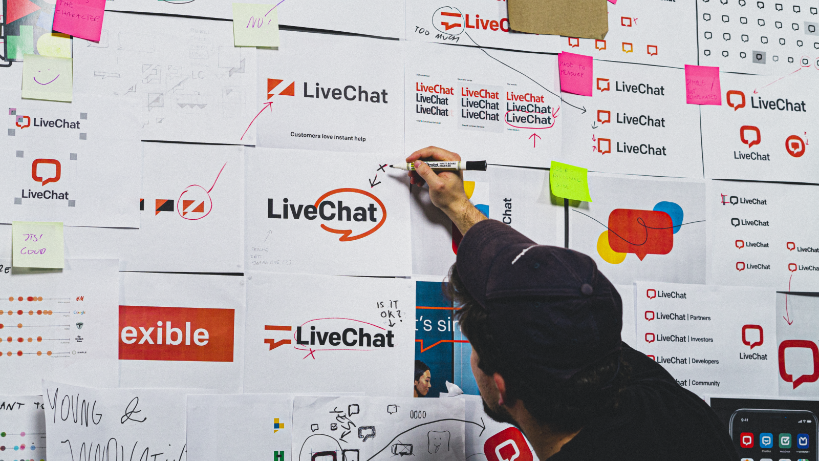
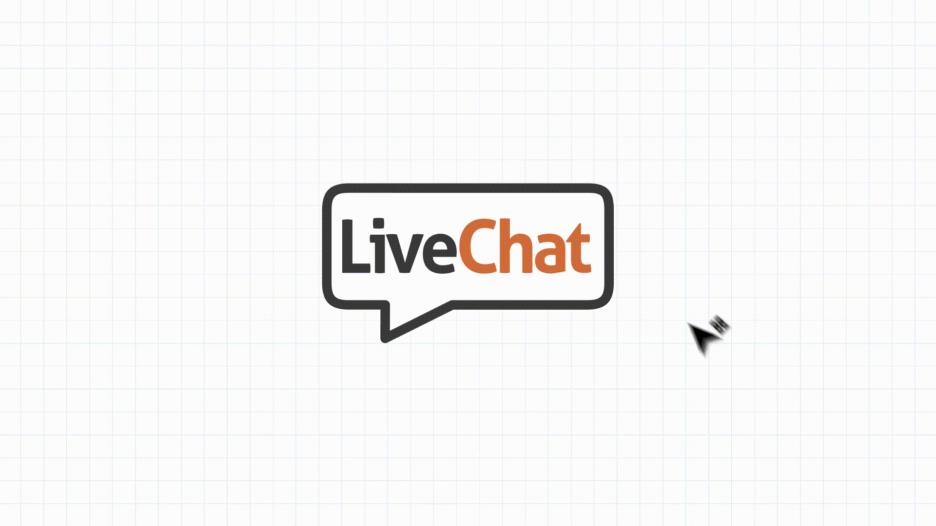
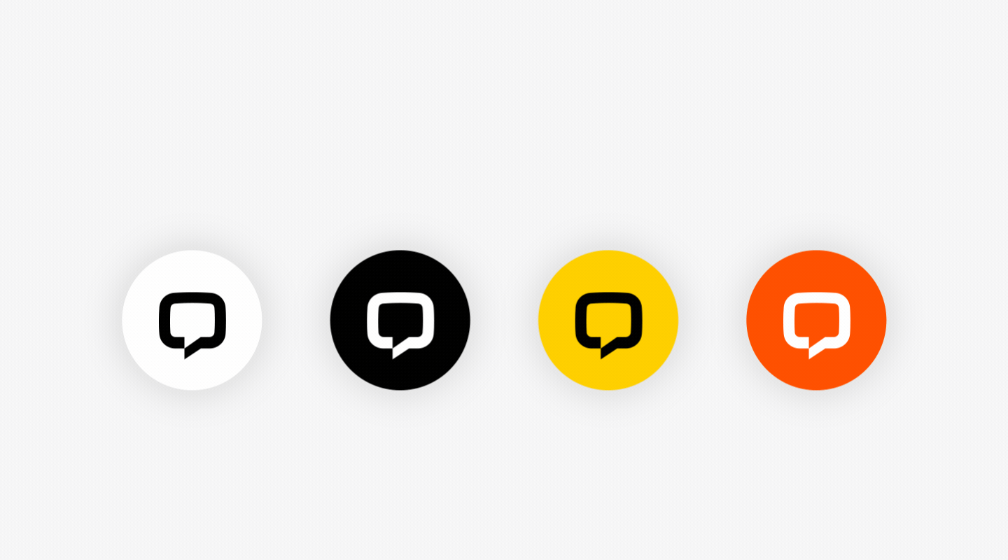
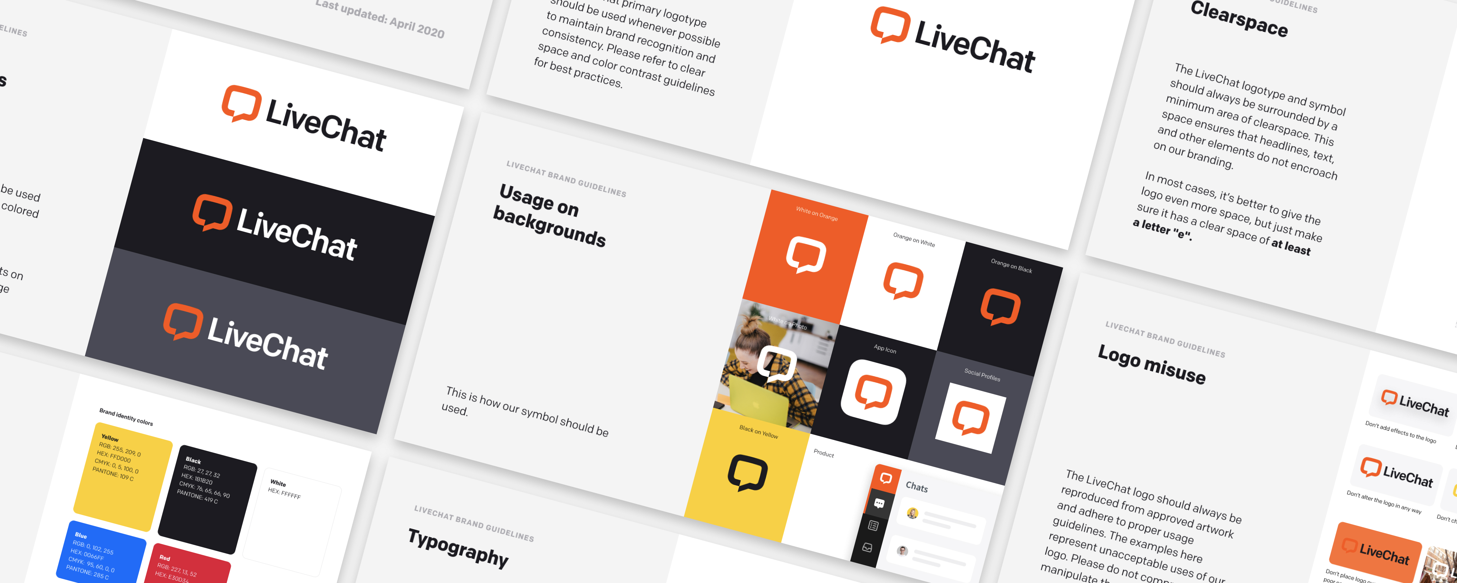
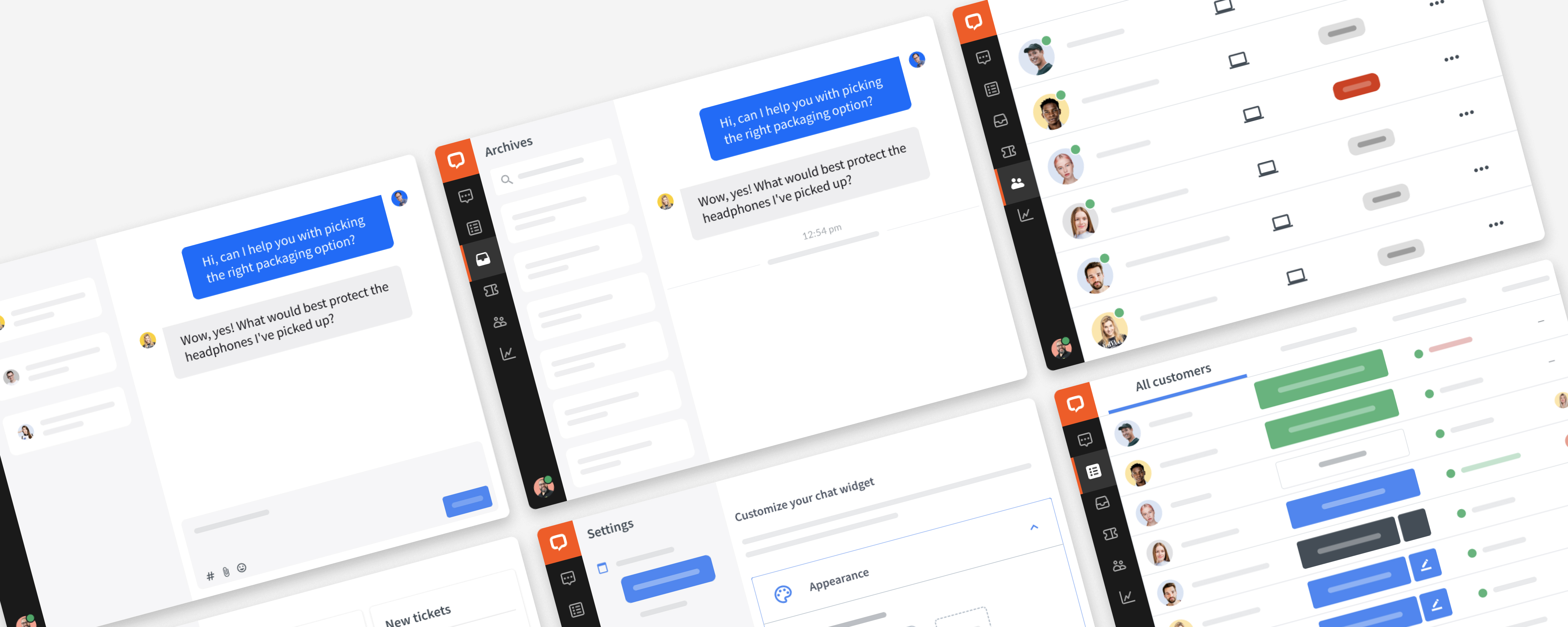
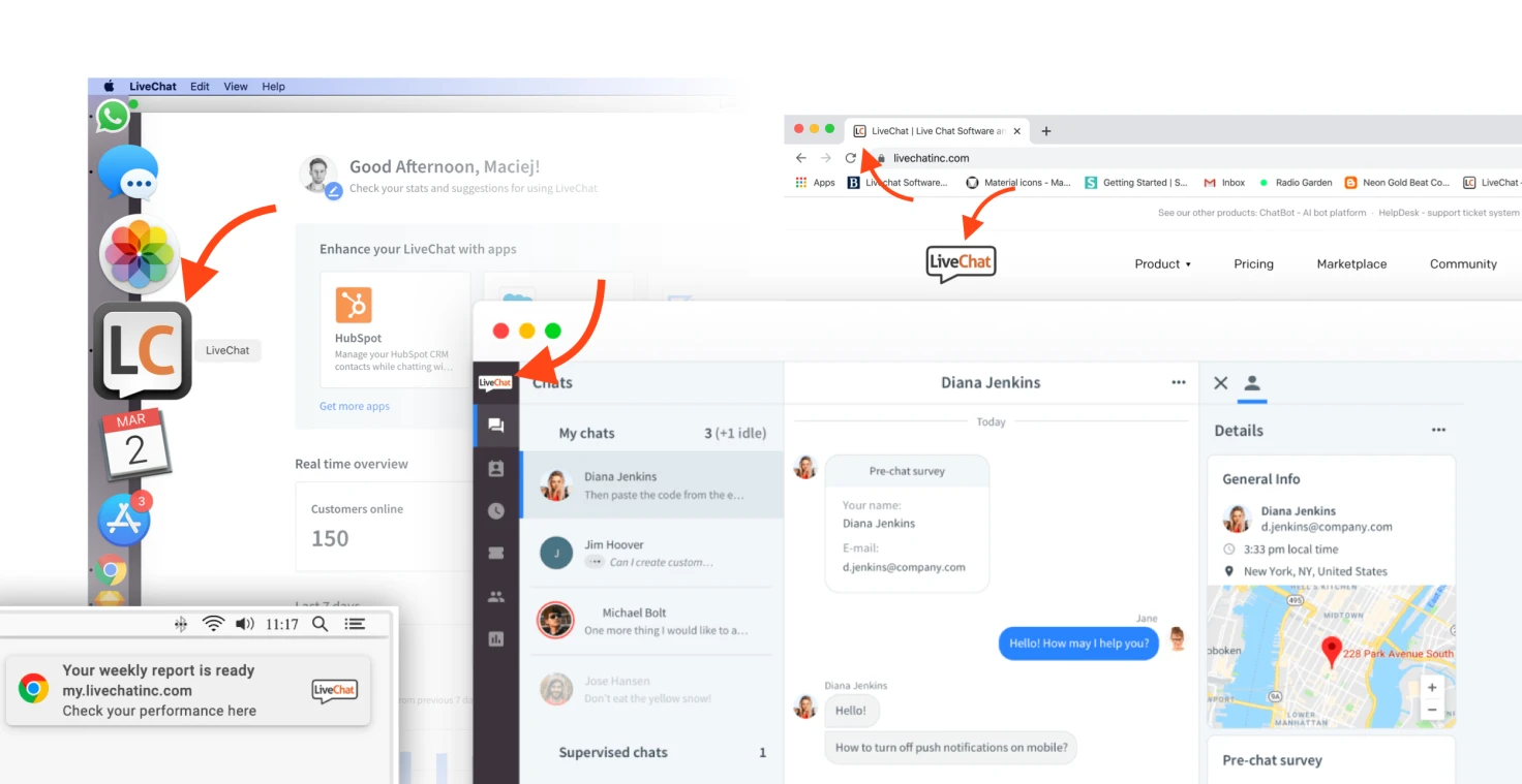
The old LiveChat logo didn't fit the digital spaces where it needed to be used. It was disproportional, and there were too many details. It was hard to develop a compact icon based on it and something that would work in any size and on any device.

LiveChat needed a flexible visual brand identity to support the company in creating new products in the future.

Process

In the beginning, LiveChat thought about hiring a top branding agency to do a comprehensive analysis and rebranding. We even invited several companies to present what they could do for us. But as a bootstrapped company, we had no pressure from the outside to hire any contractor. Finally, LiveChat decided to do it ourselves and gave me a chance to design new logos.

Together with two other strategists in the team, we started the project by listening. We conducted several interviews to find out where the company is and where it’s heading. To make a good foundation for the project, we came out with a 48-pages long PDF "Report about the brand condition" with our recommendations on how to run the project, where our brand is, and where it could be.

Then, it was time to translate it all into something simple – the logo.

The idea was to make something so simple that it would be good for the long term. The new logo is actually a transformation of the old one. I took the wordmark outside of the bubble and kept a similar roundness in an outline-based shape. I changed the font and applied the same color convention – orange and black. That was a starting point for our other logos.

Results

New LiveChat logo after 10 years!

Increased brand awareness

From the very beginning, I saw the most significant opportunity to increase our brand awareness in displaying the LiveChat logo in our chat widget. It's like placing a billboard for free in front of the HQ of our clients. I'm proudest that the new logo functions as a chat widget, which now serves 27,000,000 chats monthly!

Unified suite of products

LiveChat was struggling with different product logos. It was a blocker for creating more unified websites, ads, and social media presence, which in the long run was planned to result in more cross-selling opportunities. After this change, LiveChat was finally able to sell products in bundles together more easily.

New brand guidelines

I developed the new brand guidelines for LiveChat, ChatBot, HelpDesk, and KnowledgeBase in Webflow.

Neons in the office!

Read more

You can check out the landing page made for new logos reveal and blog post on LiveChat's blog.

Email · Twitter · LinkedIn · Dribbble

©2022 Rayski Studio